
I’ve been recently searching for a new place to live. Along with that comes all the usual considerations: house or apartment, rent or buy, number of bedrooms, kitchen size, etc. But there’s one key point that’s equally important but much more difficult to get accurate answers on: commute time.
There are some recent studies suggesting that long commutes can be detrimental to mental health. Obviously, it plays a component in our all-important work-life balance too. For those of us lucky enough to work from home during the COVID pandemic, the extra time savings were probably pretty noticeable!
Yet a household’s commutes are complicated. You might have two or more people commuting, by different modes, at different times of the day, and even different schedules during the week. And what about traffic?
A simplistic approach would be evaluating each house listing individually by using Google Maps to do a mock navigation, but it’s immediately clear that this isn’t scalable — not with the rate that rental and house listings are posted! Nor is it an approach based on true first-principles thinking.
So instead of asking “does this house minimise my commute?”, I asked myself the question: “where is my house to minimise my commute?”
Our goals
As with all our data projects, I approached this from our three pillars:
- Data strategy or “what am I trying to achieve here?”: I want to know where I can live to minimise my commute for a better work-life balance
- Data management or “how am I going to get the data?”: we’ll need to build or find a data source on commute times
- Data analysis or “how to gain intelligence from data points”: how do we merge commute times into a fair and representative model for my household?
A simple first step
I know my ideal location lies somewhere within, say, 25k of the Brisbane CBD, so we firstly break up the city into a grid of coordinates.
Our data management pillar tells us we need to find a good source of commute data, and luckily we have this in the Google Maps Distance Matrix API! This API lets us simulate thousands of commutes in an instant.
By using the API on the grid of Brisbane-based house locations, with a destination of the Vaxa office in Paddington, we can see how travel times look across the city in the morning.
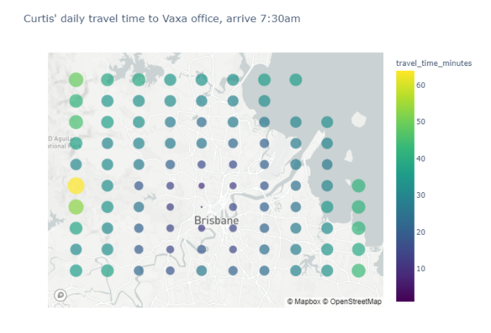
No surprises here, the quickest commutes are those that originate closest to the office! But our household does more than commute to the Vaxa office every morning.
Gaining the full picture
Our data management pillar again tells us: we need more data (in the right format) — before we do further analysis.
This missing picture here is a model of when and where we commute over the course of a week. For our household, this looks like (well sort of – randomised for our privacy):
- Curtis: 2.5 visits per week at Vaxa, 1 visit to eastern suburbs, 1 visit to northern suburbs
- My partner: 3 visits to Kelvin Grove, 1 visit to Brisbane CBD, 1 visit to Caboolture
Now we also have a grid of destinations in addition to our Brisbane grid!
We can input this into our model — which talks to the Google Maps API — to determine a weekly travel time for our household (filtering out excessively long commutes – so we can see what we’re dealing more clearly):
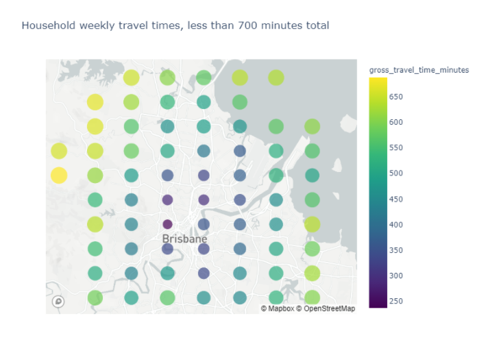
Great! We can start to see some really strong contenders appearing under this model now. But is it fair?
A fairer model
As it stands, we’ve only looked at “whole of household” travel times, but this is a bit unethical; what if it highly favours one person’s commute times at the expense of another’s? And how do we do that while fairly weighting the overall travel time?
Firstly, we can address this by updating our model to consider weekly travel time spread — the difference between the longest commutes and shortest commutes.
Secondly, we can establish weights for each of the parameters (overall travel time and spread). In this case, lets say we consider them to be equally important.
Combining these two factors gives us the below graph, where the green line shows our overall model outcome.
In real terms, the green line shows us which houses give the best overall outcome for both travel time spread and overall travel time.
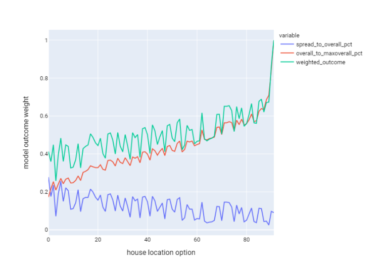
I’ll say we only want to consider outcomes where the value is less than 0.5. This is mostly arbitrary as I want to narrow the suburb search quite dramatically, but one could fine-tune this to fit their needs, of course.
Applying this to our map view leaves us with an overall ranking of 47 remaining suburbs — 1 being the most desirable under this model.
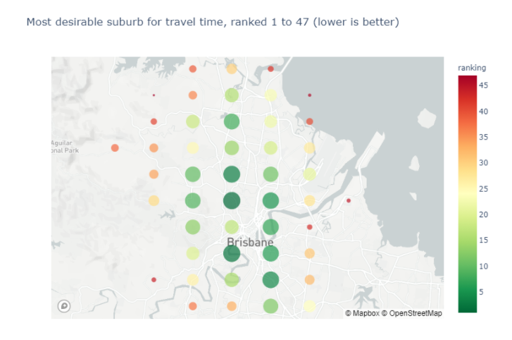
Now we can see exactly where we ought to be looking! I hope this has shown you how a well thought out and executed analytics approach can bring accurate answers to complex problems.
Have a complex problem of your own? Get in touch with the Vaxa Analytics team for a chat.